THE SITUATION.
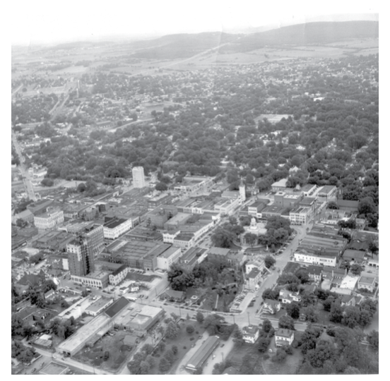
Huntsville, Alabama has long represented innovation and exploration. A city consistently named as one of the nation’s best — on jobs, quality of life, economic development, and ambition. Nestled between the foothills of the Appalachians and the unexplored horizons of Mars and beyond, it has a pioneers’ drive to press forward, go further, and reach higher.
No one part of the city’s story speaks louder than another. Neighbors, opportunities, residents, businesses, leaders, workforce, students, and dreams — each has always written its own chapter.
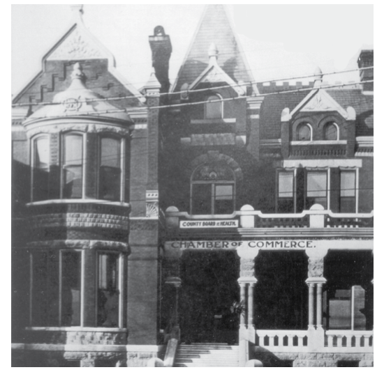
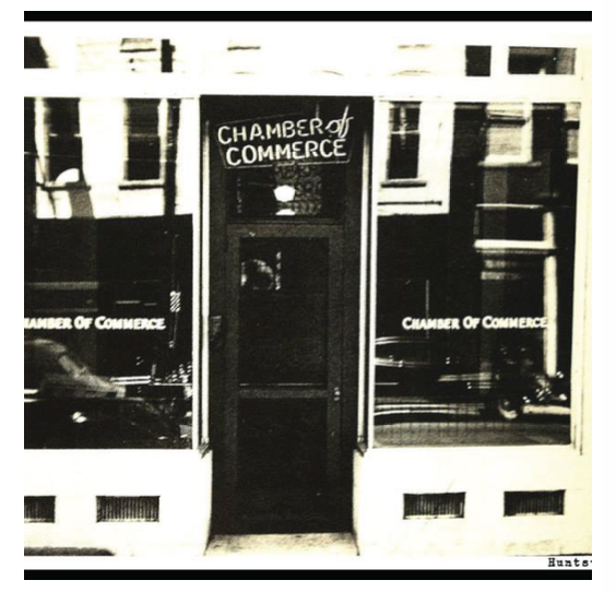
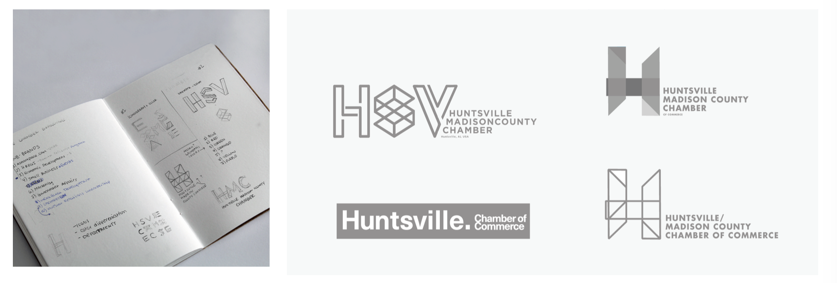
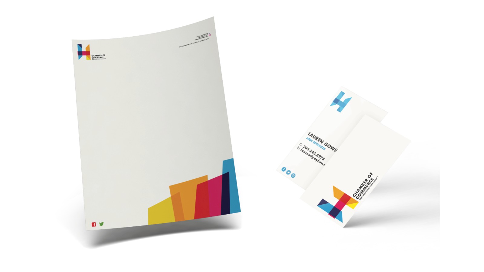
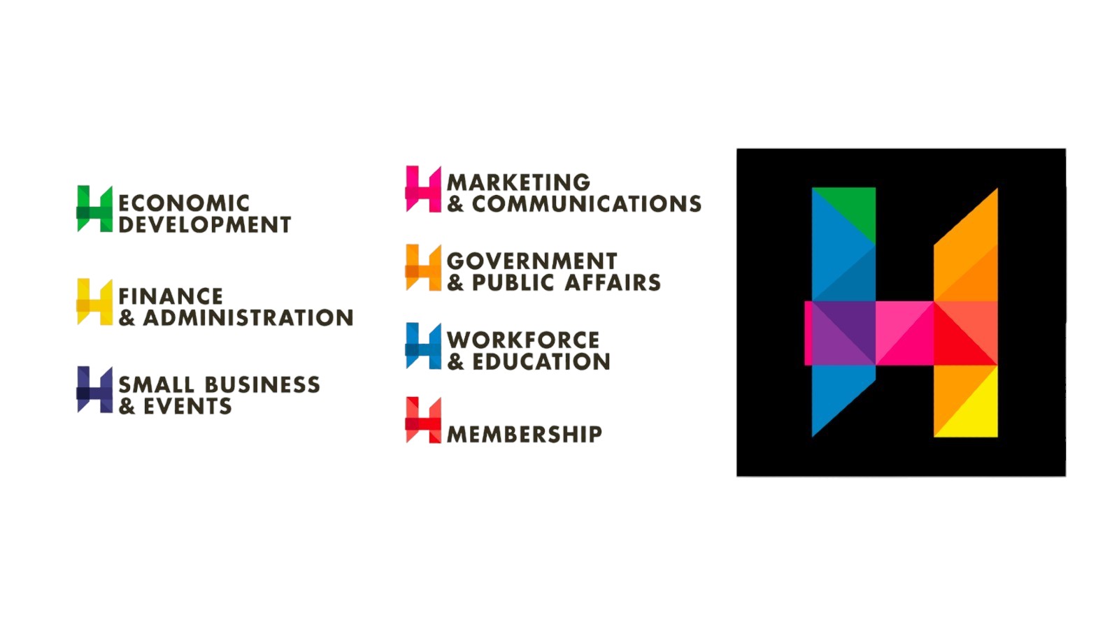
Wanting to better represent the full diversity of the Chamber, its services, its membership, and its community, the Huntsville/Madison County Chamber hired Red Brick to evolve their brand to fit a community that is ever-changing and always evolving. The organization’s roots run deep — and its future runs deeper.
THE BRIEF.
Trent had been building things in Huntsville for years before the Chamber brief landed. He knew the city — its aerospace roots, its research institutions, its sudden and genuine growth. That familiarity mattered, because the Chamber wasn’t just asking for a new logo. They were asking for an identity system capable of representing a region increasingly speaking to a global audience. Economic development at scale was a growing segment of their work, and the brand had to carry that ambition without abandoning the community it came from.
Trent led the engagement as creative director and brand strategist — setting the brief, directing the design, writing the copy, and holding creative control through every phase. His team included a designer, a developer, a photographer, and a videographer.
The goal was singular: build a mark that could carry Huntsville’s weight — its heritage and its horizon — without collapsing under either.
THE DESIGN.
Most identity systems are built to be fixed. One mark. One palette. One approved configuration. Trent built this one to do the opposite.
The concept started with a question: what should the brand of a city like Huntsville actually look like? A city growing faster than almost anywhere in the South. A Chamber representing aerospace and small business and workforce development and government affairs in the same breath. A community defined not by one thing but by the constant movement between many things.
A static mark couldn’t carry that. So Trent designed a system instead of a logo.
The geometric forms — triangular, interlocking, built from the letters H and M — were conceived as a kit of parts. They could be assembled differently every time: different color combinations, different configurations, different arrangements for different applications and different moments. The brand would never look exactly the same twice. It would always be unmistakably itself.
Color was the engine of that flexibility. Getting the seven core hues right was one of the hardest problems to solve — each had to hold up on white, on black, and against every other color in the system, in any combination. Exhaustive testing. Countless iterations. The goal wasn’t a palette. It was a grammar.
The wordmark is set in Futura STD Bold — chosen deliberately for its clean, direct structure, which echoes Redstone Arsenal, Marshall Space Flight Center, and the government institutions that shaped Huntsville’s identity. In the finished mark, overlapping forms are both lighter and darker where they connect, suggesting translucency rather than solidity. Open. Transparent. Alive.
THE RESULTS.
From cards carried by employees to a new responsive website — every touchpoint rebuilt from a single, unified system. Not a fixed one.
The new mark represented both the Chamber and the full suite of its services — one system for the entire organization and everything it would become. It replaced a previous mark that had limited the Chamber to one city’s identity and a historic, but inactive, era of America’s space program. The seven departments each received a signature color. Their overlapping forms express connection. In contrast to the dim palette of the old brand, the new system uses an additive mix — brighter, more vibrant. Lighter. Fresher. Bolder. More optimistic.
The system was built to travel. When the Chamber sent a delegation to recruit manufacturing investment at a German auto show, the mark didn’t need to be replaced or supplemented. The geometric forms were simply recolored in the colors of the German flag — black, red, and gold — and the identity arrived already speaking the local language. Same structure. Same geometry. Completely different context. That adaptability was not a workaround. It was the design.
THE TAKEAWAY.
Brand work at this scale — rebuilding the identity of a region’s largest civic organization — requires two things most agencies can’t provide: genuine community knowledge and the discipline to solve hard design problems without shortcuts. Trent had both.
He had spent years in Huntsville before this brief. He understood how the city saw itself, how it wanted to be seen, and the gap between the two. That fluency is what made the collaboration work and what made the result feel inevitable rather than imposed. The best identity systems don’t just represent an organization. They represent the place it comes from.
That bold optimism — at its strongest when the elements form the primary “H” — connects to the history of the community’s first settlers, soldiers, and scientists, and the confidence of the region’s growing role in the global economy.
The discipline that produced it — clear brief, hard creative problem, no shortcuts — is the same discipline Trent brings to every engagement: corporate rebrand, executive positioning, campaign strategy, crisis communications. The category changes. The standard doesn’t.